Thursday, 29 April 2010

Final Main Evaluation: Priya Ahluwalia

In what ways does your media product use, develop or challenge forms and conventions of real Media products?
During the planning of the film we as a group decided to use the conventions of social realism.


The main conventions of a social realism film are:
· An urban Setting
· mise en scene – Natural lighting, hair and make-up reflecting the time, diegetic sound
· camera work – number of shot sizes and angles
· editing – usually straight cuts are used

What is social realism? Social realsim is
a type of art that realistically depicts subjects of social concern and locations those are realistic and more believable than Hollywood films.
Crawley Town Centre is a location that we have used to show the conventions of a social realism film.

Issues: Like many social realism film focus on a particular topic such as in wasp (it would be young mums or lone parents, we have decided the topic on mental illness.


This film studies this topic and shows how the character comes around telling the audience what has happened. Today in schools a subject like this is not mentioned however some people go through this day in and day out and others would ignore the fact that this is happening to teenagers as well as adults. Mental illness would include bipolar disorder and schizophrenia.
Related films seen: Making sure that we were not rolling of track and trying to make a film look like a Hollywood blockbuster we looked at a film called ‘dead man’s shoes’ by Shane Meadows. This film is based on one brothers revenge (Richard) on people who killed his younger brother (Anthony). http://www.youtube.com/watch?v=_vAk3Og3HLA The interesting thing about the film was that Anthony is seen in the film however he is not really there and therefore makes the film more interesting seeing how Richard talks to him even when he’s not there. This inspired us to use one of the characters to talk to Ashleigh but in actual fact she is talking to herself.

Social realism directors:
Shan Meadows - is an English film director, screen writter and occasional actor. He has done a number of films that are well known to the British audience such as ‘This is England’, ‘Le Donk and scor-zay-zee’, ‘Somers town’ and many
More.


Ken loach - is an Englisg film and television director. He is known for his naturalistic, social realist directing style and for his socialist beliefs, which are evident in his film treatment of social issues such as homelessness (Cathy Come Home) and labour rights (Riff-Raff). Before we could start the short film we watched short films that would help us to structure our film. Here are some of the films that we saw
·Wasp - is written and directed by Andrea Arnold. It stars Nathalie Press as a struggling single mother determined not to let her four young children prove an obstacle in the pursuit of rekindling a relationship with an old ex-boyfriend
Danny Dyer. Dartford (Arnold's hometown) is the setting. http://www.youtube.com/watch?v=BN6BSVl1zQY

· Lou –lou lives here -
http://www.youtube.com/watch?v=7h6mc1H-t5Q

. Joyride - http://www.youtube.com/watch?v=KP3KYL8ulW8

Furthermore we also looked at happy go lucky and Brief Encounter. I found that in some films they have used stereotype comments such as in Happy go lucky the driving instructor makes a remark of locking the car doors as some black boys cycle along the road (

http://www.youtube.com/watch?v=HN_kOED6zGE )(5:20). I feel that this film was a great help to us with what a social realism film should be about as it uses topics that apply to everyone. http://www.youtube.com/watch?v=Sd4EG6BeDV0 (Trailer)

The opening: The film starts with the main character in bed. This does not give much away about the story of the film. During the research process we decided how we wanted to open the film without it looking strange as well as keeping the audience focused and making sure that we keep with the genre being social realism. We feel that to make a social realism film the main concept for the film is to make it look natural as possible. I feel that we have challenged the conventions of a social realism film. The main aspect would be that we have a character that starts to disappear and is seen fading away. We have also kept an enigma code revelling the story at the end of the film; this is mainly because it keeps the audience engaged. The enigma code is usually used in thriller / horror films however we decided to challenge and see whether it works in social realism film. We keep the audience confused of why one of the character continues to disappear during the film which creates questions to why this is happening.
During the process of the film we have tried to use all the conventions as possible


Mise en scene:


To create social realism atmosphere we used natural lighting as many scenes are in the town centre and park.
This creates a natural and expected atmosphere.
Opening is set in Kate’s bedroom. Red heads were used as the room appeared fairly dark.


Décor:


. Most of the footage is shot in the town centre, this adds to the effect of realism.
. We tried to make the house look realistic; we made the characters room like a teenagers room with posters and objects left on the floor.


Hair & Make-up:
is used to make sure that the actor fits the role of the character that they need to portray
. Kate is not wearing any make up showing her natural self.
. Her hair is up and giving it a nice tidy look.


Diegetic / Non Diegetic Sound: Diegetic sound is any sound presented as originated from source within the film's world and no diegetic sound is represented as coming from a source outside story space.
. Non diegetic is used in this piece.
. We have used voice over and background music to create the effect of social realism.

Editing: Is part of the
post-production process of filmmaking. It involves the selection and combining of shots into sequences, and ultimately creating a finished motion picture. http://www.ehow.com/video_2384818_edit-documentary-film.html this is a link to show you how to edit a film and the key concepts
. Typical use of editing is used; dissolve and straight cut
. Dead man’s shoe was one of the films that have used both these types of techniques.


How effective is the combination of your main product and your ancillary tasks?
To make a film successful it is just not the film that does all the work, but also the review for the film as well as the poster, the distributors


Film distribution:
In the film the expression "distribution" refers to the
marketing and circulation of movies in cinemas, and for home viewing such as DVD, Video-On-Demand, Download, Television etc. A film distributor is an independent company or occasionally an individual, which acts as the final agent between a film production company or some agent, and a film exhibitor, to the end of securing placement of the producer's film on the exhibitor's screen.
http://www.youtube.com/watch?v=krGXTTt--go (talk on Distribution).To market a film there are many ways to screen the finished piece, however not all films made go onto mainstream but for home viewing also known as independent films. Independent film making often takes place outside of Hollywood, or other major Studio systems. An independent film (or indie film) is a film initially produced without financing or distribution from major movie studios.
For this piece of coursework we have designed a poster a review as well as film. i feel that to market a film the poster and the review are also the most part of the film as it shows the audience what they are going to be watching without telling them the story.


Poster: The poster is the most important part for distributing the film as it leads the audience into watching the film. Furthermore the poster does not give much information of what the film is about; therefore it builds up and creates expectations for the audience that you then have to make. Before we could start deciding what our poster is going to be on we looked at a number of posters from social realism films. Some of the posters that we looked at were; ‘This is England’ (
http://www.youtube.com/watch?v=H0jkv2bRFgQ) (Trailer), ‘Fish Tank’ and ‘Le Donk’ (http://www.youtube.com/watch?v=8-hmSRgZHc8)( Trailer) .‘Fish Tank’ was a poster that
we looked at in great detail. Here are some points noted on the poster.
. First of all the main character is a female which indicated who the targeted audience is
. Her body language - she is looking out of a window, which may suggest that she is trapped, she is not looking directly at the camera which also suggests and indicates that she alone, alienated and in a way she is unhappy.

. The background – light pink wall colour; stereotype female colour; another indication to female audience, it’s got a ripped wall paper, that may suggest that she does not live in a great house, can also indicate that she may be living in a council flat.
. Costume – black plain t-shirt, showing she’s not very fashionable, big hoop earrings, a stereotype for ‘Chav’.
http://www.youtube.com/watch?v=a7BFZqQ4ruA (Trailer)
Myself and Maiken Davidson both designed a poster each. We looked at great detail what we wanted to include in our poster. I had a number of ideas of what I wanted the poster to have.This is the poster that my group decided they wanted for the film.
. We have used big, bold and black title so it stands out.
. The background of the poster is taken from the film; this is mainly because it is a main feature of our film and a very key place for the main character in the film.
. The main character is in the front looking over her shoulder towards the swing once again indicating that something has happened and that the swing is a key object in the film, also suggesting loneliness and sadness.
. Because both the characters in the film are females and the main character on the poster is a female this indicates that the film is targeted at females
. The characters costume is black and white, very plain, jewellery, signifying that she is mourning someone
. Furthermore because we have not shown much in the poster it makes the audience to imaging what the film might be about.
. Putting an age certificate on the poster, makes the poster look slightly more realistic as well as adding star rating and comments from Bliss, sugar and credits at the bottom of the poster.
alt="See full size image" v:shapes="_x0000_s1050">


Review: A film review is seen in magazines such as ‘Little white lies’ and other film magazines, it discusses films positively and negatively. The language that is used is normally complicated and is usually understood by individuals that have a passion for films. The main reason for whya revoe wis written is mainly due to individuals giving their opinions of the film and helping other decided whether they should go and what the film.
Our main task was to create a film review that has a layout of the ‘Little white Lies’.
‘Little white lies’ is a Bi-monthly, British independent movie magazine that features writing,


illustration and photography related to cinema. The unique quality of the magazine is that bases all the magazine around one film (usually shown on the front cover of the magazine) and has small symbols / images relating back to the film. (
http://www.cnettv.co.uk/film-and-tv/reel-report/faces-of-the-film-industry-little-white-lies-magazine-10000114.htm)


This is the review for the poster. The still that has been here is of the character by herself at the end of the film. We have made the review look like a review from ‘Little white lies’. We did this by looking at a copy of the magazine reviews and analysing what will be needed in the review. As group we all contributed towards what we would like to put in the review such as the negative and positive pinots in the film. We decided that review should be written by Rachael Saunders. Using a review layout from the magazine itself we have made the review look similar to the ones found in the magazine. The Layout of the review was Maiken Davidson responsibility.
What does the review include? In the review we have tried to make it look the reviews from ‘little white lies’. In our version of the review we have included:
. What the film is about
. The positive points in the film
. The negative facts of the film
. The rating that the film receives
. The names of the director and the actors


Does it work? Putting the poster and the review together with the film I feel that it does work. It allows us to show our creative side for the course.
. Both character are in there late teens

. Both characters are girls indicting that this film mostly aimed at girls from the ages 12+
. The review is written using complex language that only people who live on films would be able to understand what is actually written.
. Using different still to the poster but still with only one character in the still shows that this is the main character and that she is alone. Also allows the audience to question why she is miserable and the reason to her loneliness.


Once the film was finished we uploaded the film to YouTube. To get feedback on the film I sent links to friends via Face Book of what they thought of the film. I sent a link to a number of people from different age groups to both females and male.


. We got a number of different responses from the audience of what they thought of the film
. We received negative feedback as well as positive
. Negative feedback helped with if we were told to make another film what would you do differently.
. I found that girls aged 15+ were really touched by the film and really liked that fact that we focused on a subject that many individuals try to avoid.


Examples of negative and positive feedback:

. The alarm clock: one of the feedback that member of our group received was if the alarm went off there was no need for her to rush.
. Cuts did not work in some areas. (Bedroom when Kate is looking for Ashleigh)
. Audience were confused until the end
. The story line was very good
. There were a variety of shots and angles used
There are a number of things that I have learnt from the audience’s feedback. When you are trying to shoot footage of a piece of work you should never rush and should do more than one take on a scene. When we were filming the footage on one of the scenes we only did one take and it came out really bad so we decided not to put it in our piece. If we had to redo this project I would make sure that we have enough time to film the footage with more than one take as well as editing time.
The problems that the audience gave us also shows that when you film a scene you should go back and watch it before you leave the location to see if you have missed out on something or if something should be removed that should not be in the scene.


My thoughts:

My thought of the finished film was I feel that we all put a lot of time and effort into the piece and tried our best to make it a social realism film. I feel that the story line that i came up with really worked well. However the negative thing of the film was the voice over of the film. I feel that the actor could have put some more emphasis on the way she read out the voiceover for the film. I feel that if she could have done it better the finished piece would had a more meaning full reason to the story that it was trying to tell. Furthermore i feel that the cut scene when the character is looking for

‘Ashleigh’ there is cut when she looks down and then back up.
The negative thing about this is that the light of the bedroom was kept on a it is seen in the film as we did not do this scene more than once. A weakness that i found was the green scene. I feel because it was the first time using a green scene, we did come across a few problems that were seen in the film.

The Poster:


When I finished the first poster that I did I asked a couple of my friends what they thought of the poster. A number of them stated that they did not like the background of the poster as it does not tell them what they might find in the film. Furthermore they also stated that by having the main character in the front looking towards the audience made her look very dominant which we did not what and therefore I decided to change the whole design of the poster. With the new poster that I designed i asked the same friends again for their thoughts they were much happier with the background and the fact the character was looking back at the empty swing instead of the audience.

The review:


As Rachael Saunders was in charge of writing the review I and Maiken Davidson read through what Rachael had written. I liked the way she had written the review as she included sarcastic comments of the film. With the layout for the review we all did a layout of the review, the layout of the review that we used was also Rachael Saunders. This is my version of how I would have liked the review to have looked like. The reason why we did not use my review was mainly because I had designed it for it to be portrait and not landscape. Furthermore Rachael’s review layout had more room for it to fit the review in so we all decided that the layout used would be Rachael’s.

How did you use new media technologies in the construction, and research, planning and evaluation stages?
NEW MEDIA TECHNOLOGIES: Here are some of the technologies that we have used:
. Green Screen
. I Movies
. Final cut pro.
. Garage band
. Blogging
. Face book
. In design
. Photoshop


Green screen: Is a technique for compositing two images or frames together in which a color from one image is removed (or made transparent), revealing another image behind it.
It is commonly used for weather forecast broadcasting, wherein the presenter appears to be standing in front of a large map, but in the studio it is actually a large blue or green background. It takes a lot of lighting to get the right effect.
http://www.youtube.com/watch?v=cPa_Gv0rHCQ (setting up a green scene)


I also looked at films that have used the concept of green screens, some examples were, 'Lovely Bones' and 'Ghost Town'.
Green screen is the new digital technology that we have used in this piece.

Skills that I have learnt using the green screen are in order for the character to be placed where they should whilst being faded away you first need to take a picture of where they are going to stand and what they will be doing. You then upload a video of the same place for around the time that you need and then place the green screen footage on top.
At first I thought that using the green screen was going to be a major task and really hard to use however it was in fact easy to use. I feel that this technology did work as even though it was complicated to use. It was good to see that people were surprised that we have used this technology as they really liked it.

Garage band:


Is a software application that allows users to create music. It is developed by Apple Inc.
http://www.youtube.com/watch?v=wbZHH75eIxg&feature=channel (talk )
We used Garage band as we wanted some background music for the film without having lyrics with it.
. We went through tracks that we thought could be used for the piece.
. As there were so many tracks to choose from that we like we cut the list to tracks that we found would go well with the piece. We did this play playing the footage and the sound track at the same time. This technique worked well.
. In total we found three tracks that were right for the film.
. i feel that the sound track was used successfully as we received feedback from the audience stating that they liked the music used.


Final cut pro: Is a professional non-linear editing software application developed again by Apple Inc.
Completing the main task I was able to use my skills that I had learnt from the previous year using final cut pro. This piece of technology was simpler and easier to use compared to I movie. This is mainly because it gave us a large variety of fonts and titling as well as effects. An example is when Ashleigh disappears in a blinding of light. Furthermore is also gave us a variety of transitions to use instead of a straight cut. In the filn we have used dissolving transitions http://www.youtube.com/watch?v=-tlkPQ3Fe8M ( how to capture footage) http://www.youtube.com/watch?v=AVQaP1Kc8NA ( Talk throught0:40)

In design:


http://www.youtube.com/watch?v=8ytvBq3Wa6Y here is a link that explains what in design is.
In design is a very complicated technology to use. I had some help from member of the group on a number of occasions
but I soon got used to the technology as I was job to crate the poster for the film.
I also got used to placing images from different software.
This was the first poster design that I came up with however talking to the group they found that it was to plain and did not like the background also needed something that would represent the main character as well as the other
This is the final poster idea that I did. I concluded that this was a really good idea and represented both the characters the story line and the title.

Here is the link to the finished film:
http://www.youtube.com/watch?v=QIF_6HOg0Kg

Monday, 19 April 2010

Final Evaluation by Maiken Davidson

1. In what ways does your media product use, develop or challenge forms and conventions of real media products?

Social Realism is the most popular genre of film in Britain, however is overshadowed by American funded British films that show little realism.


We decided that our film would reflect the works of other British Social Realism films. We did many a research into British Social realist’s films, the film itself and the conventions of British Realism to the directors and actors.

http://www.screenonline.org.uk/film/id/1037898/index.html

Mise en scene

  • Naturalistic lighting
  • Exterior settings, recognisable and mostly real (On Location)
  • Props used need to reflect what the film is about for example if it is about working class you would want see stereotypical working class items in the background.
  • Desaturated colour
  • Costume appropriate to time and era the film is supposed to be for example A Sixties style film you would expect to see the clothes and styles of the Sixties.
  • Not well known actors, though this can be challenged in the form of Danny Dyer who is relatively famous but appears in quite few social realism films.

Themes and Issues

· Stereotypical representations on age, gender, ethnicity, class and so on.

· However challenging these stereotypes as well.

· Gritty issues that aren’t showing in big British films like Love Actually, Notting Hill etc.

· Typical everyday problems for example family, relationships and stereotypes

· Using different time periods that were relevant of our history.

Camerawork and Editing

  • Eye level shots
  • Close up detail of characters
  • Handheld camerawork
  • Establishing shots, that show real locations that we can relate to as the audience

Sound

  • Environmental or Diegetic
  • Use of sound being repeated
  • Accents (Particularly Northern)

And finally a convention of a British social realist film is that it is low budget.

British Social Realist theorist Samantha Lay (2002) summed up social realism to be: ‘Life is represented as it is really lived, grounded on social issues and its settings.

To support the above here is a clip from a BBC2 show that discussed British social realism and why it is so unique.

http://www.youtube.com/watch?v=Wj9yvVDwhX0

Social Realism Directors ( to name a few)

  • Ken Loach
  • Shane Meadows
  • Mike Leigh
  • Andrea Arnold
  • Stephen Daldry

They are all unique in the way the work.

Andrea Arnold

·        Fish Tank http://www.youtube.com/watch?v=gg1yMOdjyp0

·        Red Road http://www.youtube.com/watch?v=dSfy6UpAXKQ

·        Wasp http://www.youtube.com/watch?v=BN6BSVl1zQY

I did my own personal research into Fish Tank as it has had a lot of press lately as its been screened at film festivals all over the world. I also researched into the director Andrea Arnold, as she is one of few female directors (who has done extremely well) in a very patriarchy area of work.

Fish tank conformed to the conventions of the social realism genre, but what was unique was how Arnold found the main character Kate Jarvis – in a street arguing with her boyfriend, and put her into the film straight away. Knowing this gave it a more gritty feel, as it was very true for Jarvis and so was well represented to the British Audience.

Arnold is well known to shock members of her audience in a film and this is what gives her the edge over other directors.

Mike Leigh (http://www.imdb.com/name/nm0005139/ )

http://www.youtube.com/watch?v=tsA-ZrY8cOY In this clip he discusses his film Happy-Go-Lucky, and how he doesn’t have a script when he films.

In class we did a lot of research on Happy-Go-Lucky as it introduced us to the social realism genre.  It has the conventions of a British Social Realism film;

·        Relationships between friends, co-worked and a love interest.

·        The thin line nowadays between femininity and masculinity.

·        Shows traditional roles of women/men and non- traditional roles of women/men.

·        Deals with social issues

·        Recognisable landmarks, it is mainly based in London, we have one shot that shows us ‘Camden Lock’.

·        Costume is modern, and not unusual to what we see today.

·        Characters are relatable.

·        Multi-culturalism

·        Mise en Scene – red buses, graffiti, street names, pubs, drinking tea etc.

·        Sounds used are mainly diegetic and ambient. Use of popular British song from a popular British Band (Common People – Pulp).

·        It is low budget, funded by Film4 and the UK Film Council.


Ken Loach (http://www.imdb.com/name/nm0516360/) only works on location and has rarely ever used a studio for his film pieces. He also has a full script prepared, but does not give it to his actors until a couple of days before. Below is a selection of interviews of Loach at the Raindance Festival in 2007, discussing how he makes his films.


  • We also researched on ‘Dead Man’s Shoes’ directed by Shane Meadows. As it is a British film that has the subject of death and a ghostly character, although ‘Dead Man’s Shoes’ is a different genre entirely to our film ‘Remember me’, it was good to shows us how to use our two characters in a similar to the way the two characters are in ‘Dead Man’s Shoes’. It also shows emotion and how Richard (Paddy Considine, the main character) deals with his ghostly brother always around him. It also followed the similar conventions of a British Social Realist film which I have listed above.


      •  

    Not only did we study featured length fils. we also researched in to short films as well;

    • Lou-Lou Lives Here
    • Mix tape
    • Wasp
    • Joyride
    • Conversation Piece
    • Eight

    It was useful to research into short films, because it showed us what we could achieve in 5 minutes; it helped us to be able to start writing our plot as it sowed us how to do the beginning middle and end. 

    Collection of Shane Meadows short films: 


To make a film successful, you can't just rely on the films itself. You need to advertise it by using film poster and having critics write a review. To achieve this you need a distributor who sends out a press pack as part of the marketing process. When doing do you need to know who your marketing for.
The group discussed about who are demographic would be when we first started the process for our film, we then later discussed it again with our finish filmed and how we want ancillary tasks to attract - just as a distributor would do.
Our products demographic is of female teenagers to young women who are middle class as our Film was made on location in a very middle class area and are actors costume and how they presented themselves was in a middle class way.


  • Film Poster


      Above is our film poster designed by Priya Ahluwalia in Photoshop and Indesign, we all discussed what need to be put on to the poster and made the decisions together on the layout, style, font used and so on.


    • Representation of Characters

    We only have a female characters in 'Remember Me' and this is shown through our poster as we just have Kate - making it quite clear that a main audience is female.

    Kate is not looking at the camera but behind her towards the empty set of swings, this suggests loneliness and sadness.
    Looking behind suggests looking back at the past and remembering the good times.

    We have used a Medium close-up, so we can only see the top half of her body.

    Kate is only wearing black and white - sign of mourning.

    • Location

    Park (seen in Film).


    • Themes and Issues
    Supernatural.

    Mental Illness.

    • Colour
    The background picture has been de-saturated - which is a well known convention in social realism.

    Kate hasn't been de-saturated of colour, this suggests that she is living in the present where the faded backgrounds represents the past.

    Black and Grey font suggest genre of film to be gritty and sad - dealing with death?
    • Font
    We used simple font

    'Remember Me' is in block capitals, large and is in bold to stand out.
    The other font used for reviews, directors name and credits was small but in black font so you were still able to see it but not to go over 'Remember Me'.
    • Other conventions
    Actors names
    Certificate - 12a
    Logos of 'Little White Lies', 'BBC' and 'Dolby'.
    Tagline - 'One's best friend, is Oneself' which is said in the film.
    Date of films release.
    I believe are poster portrays the plot of the film well, it shows past and present and the idea of looking forward not back on the past. Asking peers what they thought of the poster before and after seeing the film said 'that it makes you appreciate what you have now, in the present' which is how we wanted our film and poster to say.


    • We also researched into other film posters. Fish Tank (shown above) was one that we looked into great detail.
      1. Female (shows who is the target audience).
      2. Doesn't look at camera suggesting alienation and sadness.
      3. Its in an urban setting, what we would stereotypically think an inside of a council flat looks like.
      4. It is working class, by the costume she is wearing and the ripped wall paper.
      5. The colours used pink and baby blue suggest femininity along with the hand drawn pink heart which again suggests that this film is targeted towards women.


        • Film Review

      A film review is a written evaluation by a critic, in t

      his case a fi

      lm critic, they are usually found in;

      • Broadsheet newspapers
      • Magazines (Total Film, Little White Lies specify in the film area)
      • Internet
      • Television (Jonathan Ross)

      A review is extremely important to the producers of the film because a review helps people to decide whether to go see a film or not. By researching film reviews, you can see a trend that mass-marketed films are not affected by critics reviews, it is the smaller, independent films that are affected more by such reviews.

      For the film review, we studied Little White Lies a film magazine.

      • Each issue is themed around a single cover film, inspiring the design and content of that issue.
      • The magazine not only covers small independent films and Hollywood blockbusters, but also other areas of popular culture such as music, art, politics, festivals and interviews with actors.
      • Its target audience from as far as we can tell is for young, middle class males. We have worked this out by the language used his humour ( from studies of magazines this is what you would particularly get in a lads mag) but language used is articulate and of middle-class language.
      • The magazine itself is distributed by The Church of London

      http://www.littlewhitelies.co.uk/

      http://en.wikipedia.org/wiki/Little_White_Lies_(magazine)

      http://www.thechurchoflondon.com/

      We studied past issues of Little White lies on how the presented a review;

      • Layout
      Screenshot of film above review, or in top right hand corner.

      Each review was 3-4 columns

      Title,released date and directors/stars (boxed, each had 2 colors and well placed)

      First line of review is bold

      Who had written the piece in bold

      Ratings - 'Anticipation, enjoyment and In Retrospect'

      Page number in corner, with reference to the featured cover film
      • Language Used
      The language used in a LWL review was very film literate and complex as well as humor.

      Reference of other Directors, Producers, writer, actors and films

      Quotes from film the review is being written about

      Synopsis
      Here is an example of a page from Little White Lies latest issue.

      So when it came to our review we all met up in the group and discussed who would be the best person to write the review and what needed to be mentioned in the review. We decided that Rachael would be the best to write the review as she has had more experience in doing so because of the other subjects she studies.
      However, we all discussed what needed to be mentioned within the review, to decide this we looked back through feedback we had gotten from our peers - to see what the main positives and negative feedback we got, to incorporate into our review, making it less biased if we just decided ourselves what should go in.
      • Positive
      Cuts and Edits

      Camerawork
      Story-line
      • Negative
      The actress Kate
      Voiceover (mono-toned)
      The beginning sets you up for a different genre of film than the end result
      I was in charge of the layout, which I produced in Indesign. I tried my best to follow the conventions of LWL review layout by using:
      • 4 columns
      • Screenshot from film
      • 3 boxes with the 'Film Name', 'Released date' and 'Directors and actors' - and that they weren't in align of the columns
      • LWL's rating system 'Anticipation', 'Enjoyment' and 'In Retrospect'
      • The first line of the review in bold and the who the review was written by in bold
      • When the name of our film was mentioned in the film it was put into italics.
      I found it hard using Indesign to design the review as I haven't used it very often, and now looking back at the review I have noticed a number of conventions that are missing:
      • Page number
      • A drawing of some sort to reference the cover film
      • The columns are to short and wide than the ones that you see in LWL.
      Below is our review:


      Overall, I believe are review to be brutally honest and is in the language of a Little White Lies copy. I also believe that the layout would be very convincing if was placed in an actual issue of LWL, however there is un-ignorable mistakes that I have mentioned above.

      3. What have you learned from your audience feedback?

      I uploaded our film onto youtube and I posted the link on to Facebook and Twitter to gain peer reviews as our target audience is the same age demographic to these social networking sites and then asked them to comment back on our film on their likes and dislikes of it, whether they understood the plot and so on. I also asked family members and other class mates to get a wide range of reviews, in age and gender, however the main target audience for our film is teenage girls, as the only characters in the film our two teenage girls and deals a lot with emotion and mental illness, which women tend to by more sympathetic towards.


      We got a fair mixture of positive and negative reviews, which helped us a lot when it came to writing our review and when making decisions about the poster, raising the question whether we should reveal more of the plot in the poster or not.

      Pros.

      • Many people complimented on our opening shots and that they were very well used. When filming we had decided to film a variety of different angles so when it came to editing we would have a lot to play with. Much of the feedback agreed that the way we used different angles throughout gave our film an edge and was an improvement from our Foundation Portfolios.
      • The order of the scenes. They were in an order that could be understood.
      • The sound, where the narrative was a little off putting as there wasn’t much emotion, they way the backing sound continued throughout helped established the mood, especially near the end when Kate realises Ashleigh is missing, however many did say that it would have flowed better if the sounds faded into the next sound than just direct cuts.
      • The end shot, when two people on swings fade away to reveal Kate sitting by herself on the swings and then zooming in, it concluded the story of the film and Kates voiceover was extremely good at that point.

      Cons.

      • Most of our cons was about the voiceover and how there wasn’t much emotion, so didn’t fit right with the film itself.

      • When Kate is searching for Ashleigh, many people didn’t like the camera at a low angle when Kate looks over the bed, they believe it wasn’t needed and was a waste of film time.
      • At the beginning when Kate is late, we don’t know how late Kate is as there is not shot of a clock or her hitting the alarm clock a couple of times and falling back to sleep.
      • Could have reshot a few shots, the green screen was obvious and the Ashleigh was cut of a couple of times. And the lighting of one of the scenes with Ashleigh in it wasn’t very good.

      All do a lot of the cons were only small, it is useful to know how observant our audience is and how we could improve it to make are product better.

      The plot was also spoken a lot in the reviews we got back, many people didn’t understand the plot to the very end when Kate says ‘I lost my friend…’, some suggested that we should let people know earlier on in the film that Ashleigh is not really there, however we wanted this effect, we wanted to keep our audience clinging on till the very end when all would be revealed. We did drop a few hints throughout the film that she wasn’t really there, but very few people picked it up first time, but after watching it again realised, if we had time over I believe we would make it a little more obvious in the middle of the narrative so our audience would understand the plot first time round, although it was supposed to be a restricted narration to the audience which seems to have worked well.

      After taking on to account what feedback I got last year on my Foundation portfolio I tried to improve on that, which I believe we did by using a variety of angles and shooting the scenes several times gave us more to play with in the editing suite. Though there are things I have learned from doing this, the fact that when filming we should concentrate more on the frame and lighting, we had to re-shoot a few times the house scenes as are framing wasn’t very good as we had empty space next to a character who should have been more centre in the frame. We also had trouble with the lighting the first time, it was very silhouette so we couldn't see our characters very well, this was because we didn't use red heads and relied on the natural light of our internal set, to overcome this decided to shoot in a different location that could give us more natural light and use red heads to give us even more light, however because of this we had very little time to edit it in so was rushed in the end which was something we didn’t want to do.

      I personally believe other weaknesses of our product was firstly the town scene, it was extremely busy when we came to film so it was very hard to film with people walking in to shots and trying to talk to you when in the middle of filming. I felts that the shots were to overcrowded but couldn't be helped because of the location we chose, the only way we could get a reasonably good shot was to keep re-shooting when it seemed quieter to get the shot we wanted. We could have improved this by going to a quieter shopping centre or at a time when it wouldn't be to busy. We also had the problem with some of the locations as we wanted to film inside the County Mall and inside a shop to show our two characters laughing and joking trying on clothes in shops that were recognisable to Britian for social realism, however because of security risks at the time we were un-able to do so, but was given permission to film outside.

      Another weakness I found in our film was the green screen, it was our first time using it so weren't sure exactly how it would turn out, I think it turned out reasonably well, but would have liked to experiment more using it and trying it in other scenes, however we told from the start that it ber ver very hard too, but if we had more time I think it would have been a challenge that we would of accepted. To research green screen we looked at one of teachers websites ( www.tuffhamster.co.uk ) who had used green screen so we could gain ideas on how we would use ours.

      I also believe we could have done better in the terms os Mise en Scene, we could of made it more like a british social realist film if we had the time by using a more well known location like Brighton and using props that would portray Britishness.

      A postive that I liked about this product was the variety of shots we done, we got as many as we could at different angles and found while editing that they were really useful and believe it gave our product more interesting.

      • 4. How successfully have you used new technologies? How did you use new media technologies in the construction, and research, planning and evaluation stages?
      For this piece we used a number of ‘new media technologies’, some of the technologies I used were similar to the ones I used for my foundation portfolio last year, and others that I use everyday became useful for researching and getting audience feedback.
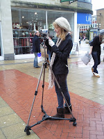
      1. The equipment I used this year was the same except for the camera. Last year for my foundation Portfolio I used an XM2 camera which gave a much better quality finished product, whereas this year I used a Sony camera (shown in the picture), which doesn’t have very good quality. Apart from this, I was very familiar with the technology we used, and experiment with the tripod to get different camera angles.

      1. A new technology we did try was green screen, none of us had used it before so it was an entirely new but something we wanted to try. There was a lot of work that had to go into it when filming which was a huge challenge. When it came to editing the green screen into our main film it was hard, we had to try and make her body stay within the frame the whole time, but at a point during our film her bottom half her body is cut off as she walks away, other than that it was interesting trying to use green screen and having the ghost character fade away and disappear gave a real effect which was what we wanted.


      2. When it came to editing our product we used Final Cut Pro – which is a piece of Apple software, which has been used for many major films out there, small independent British ones and Hollywood blockbusters, here is a list of some of the films that were edited by Final Cut Pro - http://en.wikipedia.org/wiki/Final_Cut_Pro

      We used Final Cut Pro as you are given more to play with when it comes to editing. There is more video and sound transition and filters and fonts, resulting in a much smoother product than we would have had if we used imovie. We also had more experience using Final Cut Pro, as we all used it last year for our Foundation Portfolio, I had used it for Video production, so we could all put in our own input and discuss different ways with each other. It also gave us the opportunity to use green screen as editing green screen was much easier then it would have been on any other piece of software, we also had more ways of editing the green screen piece and being able to move the shot and characters in shot to different positions within the original shot. It also gave us a more variety of fonts, special effects, transitions and edits to use within our film, for example the shot of when Ashleigh disappears we used a special effect, that made her go into a blinding of light, to give the affect that she has now passed entirely.

      When it came to deciding the font that we wanted to use for our film, we tried every one on Final Cut pro to see which fitted well with the mood of our piece. We already had an idea of what we wanted, a style on font that looked hand written but in calligraphy as it would look personal yet feminine, as females are our targeted audience, we didn't quite find exactly what we wanted, but chose a calligraphy font that I personally believed worked well. We chose to use a light faded pink colour to fit in with the femininity of the font and are demographic.

      Final Cut Pro is also much better when it comes to editing our piece together, to link scenes together we used fades and a dissolve as it suited the transition to each scene but was simple so it didn't look to over done.

      We were also able to do some of our sound on FCP, as we used a Dictaphone for the narration to go over the top of piece we had to change the sound levels for our footage so not to go over the narration, however there is a couple of times that you can hear the background sound, but it is very quiet and narration still goes over the top of it well. If we had more time than assigned to us, we would have been able to overcome the problem of the quietness of the narration in parts f our film, by watching our film several more times and note down exactly when the background noise disturbed the narration and then would have been able to go back and edit the volume of the narration on FCP and turn down the background noise.

      1. To edit the rest of the sound we used Garage band, as our film is made up of entirely non-diegetic sound. We used continuous music throughout, hoping that this would keep up with continuity and making our film flow better. Are main character Kate (Fredaylne King) was the narrator throughout the entire film. We thought this could give our film a more unique edge, we get inspiration from films such as ‘The Lovely Bones’( http://www.youtube.com/watch?v=ikUWKi0W5_g)and the ‘Twilight Saga’ as they both have female narrations. To get the narration we used a Dictaphone, we had problems with recording at first, not recording properly and then to much echo in the background on another, we had to do several recordings before we could have one that we could used. Here is a tutorial on using Garageband http://www.youtube.com/watch?v=tpUUKJeP7jE&feature=player_embedded

      2. When it came to doing research for our film we used the internet to find films sources, film articles and watch other short film clips. As we needed to know a lot about British social realism, I looked for news articles on www.guardian.co.uk and www.totalfilm.com and posted them as links onto the blog, these was so the entire group could then go on to read them and help with each of us with the different and individual aspects of our products it also gave as an idea of the film business.


      We also had done research into similar films for inspiration on the genre, plot and characters, by using www.film4.com/videos/film4-shorts
      , www.bbc.co.uk/filmnetwork/ and www.virginmediashorts.co.uk/ , not only using this but watching DVDs like Meadows ‘Dead Mans Shoes’ as it deals on the idea of a ghost haunting the main character .


      .

      We also watched other British social realism films like Leigh’s ‘Happy-go-lucky’ and Arnolds ‘Fish Tank’ so we could reflect similarity into our product 'Remember Me'.

      1. To do our Poster and review we needed to use Photoshop and In design, however this was our groups weakest point as none of us are very pro at using them, we had all used them for our Foundation Portfolio last year so we did have some knowledge on tools and how to use them. We decided to split up and each do a poster using both of the programmes and then choose whose we thought was best, we also asked our peers to choose as well. Here is mine: http://advancedportfolioahluwalia.blogspot.com/2010/03/poster-ideas-by-Maiken-Davidson.html
      I feel that I have improved my skills since starting this project as I became used to using the tools on Photoshop to edit the background picture and then to transfer it in to In design which I used to do the rest of the poster – the title, credits and such. I think my poster came out reasonably well, but we chose to use Priya’s as the image she had chosen worked better for our film than Rachael’s and I.

      To do the review we all did an example of a layout using Indesign, we then chose the one that resembled the most to the layout of a ‘Little White Lies’ review, we decided to go with Rachaels who was also writing the review. Here is an example of an issue of 'Little White Lies' and how reviews are set out. However using Rachaels template, when it came to placing the review on to it I had to make some chanages to the layout, first of all moving the boxes that had the title of the film, directors and release date to look more like the LWL layout.