The left to do with my poster are to put the credits and the awards up on to it. so i should have the poster finished by the deadline.
Tuesday 30 March 2010
Today's Lesson: Priya Ahluwalia
In todays lesson me and Maiken carried on with our poster whilst Rachael continued working on the review.

Friday 26 March 2010
Finishing off: Priya Ahluwalia
Today during my free i went with Freddy who plays Kate in our film to get some photos for our poster from the park as the photos that we had before were not clear and did not look right. furthmore in todays lesson we started cutting out and designing posters. I and Maiken have done a poster each, once the posters are finished we will upload them onto the blog. Here are some of the pictures that I took for the posters:


Draft Review by Rachael Saunders
Inspired by the tragic death of her sisters’ friend and colleague, Maiken Davidson’s short film highlights the topic of mental illness well and handles it with great sensitively. Positioning the sudden deterioration of Fredalyne King’s mental health as the central point to this touching film, Remember Me demonstrates just how unexpected the decline of mental health can be. The let down of this film is the lack of charisma in King’s voice as she describes her friendship with Anna Martorana’s character, taking away some of the sentiment from the film’s plot. The production team, however, manage the issue with confidence and compassion and are able to shed a new, much needed light on something so misunderstood.
This film is the tale of two close friends, when one of them passes away, how does the other handle it? Remember me starts off with the almost awkward scene of Kate (King) in bed, waking up and rushing around when realising the time. When watching the film, you struggle to understand why this scene is even here, with no relevance at all, it just sets the audience up for a different genre of film completely.
Cut to an outside shot, of a town and King’s character along side Martorana’s walking around, seemingly happy. Although it is not at first 100% clear as to whom the voice of the voiceover belongs to, one thing’s for certain, the dull, dreary tone is enough to put anyone into a coma. The film continues with Kate and Ashleigh (Martorana) playing hide and seek, and Ashleigh disappearing into a flash of light, it is only then that it is clear to the audience that she has no longer there, and that she has actually passed away. Other than that, the earlier hints, with her character fading away and times when she wasn’t on screen at all just look like very poor cuts.
With a very indefinite ending, the audience is left slightly unsure as to what Kate is going to do next; there is no real ending here. Just, Kate’s explanation of the last three months, this could have been what Davidson was looking for, and
Martorana invests her role as King’s deceased friend with little emotion, with both actors’ tones managing to make a highly moving script seem empty and impassive. There is certainly much promise from King, however, she seems to save any feeling she has for her break-down scene, in which is the only part in the film, when she shows any passion for the script, and her character.
Thursday 25 March 2010
Research on film reviews - Rachael Saunders
After looking at different reviews, i found that the review for 'The Lovely Bones' is very useful, because the audience is the same as what we are going for and the story is also slightly similar, with the difference being that the point of view for our film is from the person who is alive, whereas 'The Lovely Bones' is more of the point of view of the girl who has died. When writing my own review, I am going to be looking back at this one because it is going to be very helpful, because of the similarities in the film and audience.
The review was taken from the 'Little White Lies' website.
The review was taken from the 'Little White Lies' website.
"The perils of paper to celluloid adaptations have been well documented, and unfortunately The Lovely Bones gives more weight to the argument that it is an exercise in futility. Where the epic strokes of The Lord of the Rings trilogy was a match made in literary heaven for Peter Jackson, Philippa Boyens and Fran Walsh, The Lovely Bones is an entirely different animal.
It is not about the fate of mankind. It is the story of a girl, just one, and the death she must accept as her own. But somehow the eponymous bones of our heroine Susie Salmon (Saoirse Ronan, perfectly cast as a girl who is otherworldly even when on an earthly plane) are largely ignored, quite a feat for a story about a dead girl.
Jackson seems more enamoured of Susie’s pre-heaven limbo, a world in which her ravaged body is once again made replete and her murder can be sanitised. This is a place so full to the brim of gratingly obvious CGI it undermines the very real severity of what has occurred, and excises any sense of the simple wonderment in a child’s imagination.
The delicacy and finely-wrought characterisation of Alice Sebold’s novel has been removed in favour of a beyond-the-grave whodunit, subtlety be damned. The Salmon family’s grief is owed much excavation, but this is far from a year of magical thinking territory. Life, apparently, goes on in the shadow of a young girl’s rape and murder, not that we ever really know about it.
Mark Wahlberg and Rachel Weisz barely impress themselves upon the screen, while Susan Sarandon brings brief sparkle to an underwritten role, as Susie’s chain smoking grandmother, while Stanley Tucci is monstrous in a contained, clammy way. Still, none of these players signify sufficient weight to deepen or embolden the narrative.
There are several moments which invest The Lovely Bones with the same genius on display throughout Rings, such as a sequence wherein the bodies of Mr Harvey’s victims are strewn like so many dead flowers across a beautifully-staged montage, finally instilling a sense of grim fatalism, but ultimately these efforts serve only to heighten the sense of an opportunity lost.
25th March by Maiken Davidson
Today, we weren''t able to take the picture in the park for our poster because of weather conditions, however we should be able to tomorrow.
We began today to put ideas down for our review so Rachael can now start to write it and I carried on with ideas for our poster using Photoshop and Indesign.
We began today to put ideas down for our review so Rachael can now start to write it and I carried on with ideas for our poster using Photoshop and Indesign.
Wednesday 24 March 2010
Draft of poster: Priya Ahluwalia
This is one of the poster that we decided have. The main character is in color where as her friend is in Black and white representing hte past. the title is big bold in the centre of the page and the same color as the main characters hoody. I thought it would be a good combination to have. the slogan ' Ones best friend is one self' is placed at the bottom with the main character showning her lonleyness and showing that she is on her own.
I asked some friends how they find the poster and if they would be attracted to coming to watch the film. Here are some of the comments that they made:
I asked some friends how they find the poster and if they would be attracted to coming to watch the film. Here are some of the comments that they made:
I like the poster. i like that you have used the title the same color as the hoody that Freddy (Kate) is wearing, it really goes.
* Amy White
The background is intresting as it shows both characters in the film. I also like that Anna (Ashleigh) is in black and white and faded. probably showing she is a ghost
* Hannah Moore
The poster seems a bit plain, i think it could do with a busy background.
* Lisa Brown

Tuesday 23 March 2010
The review - Rachael Saunders
I am the one who is going to be writing the review for our film, so therefore in order to get it to look and sound like an actual review from 'little white lies' i am going to buy my own copy of the magazine and go onto the 'little white lies' website to look through some reviews and analyse them, so I can take some ideas from them and use them in my own.
I am also going to look at our film a few more times and choose some quote to put into our text. Looking at the feedback we have received about our film is going to be extremely helpful when trying to write about the positives and negatives on our film, as it will make the review be much more honest, and not just my own or other members of my groups opinions, which would likely be quite bias.
The review needs to be between 800-1000 words, which i think will be quite easy to do as all three of us have received a lot of feedback from people and i will also be describing the plot of our film, so there will be plenty to write about.
To make our gradings at the end of the review more honest, I will ask other people what ratings they would give our film and whatever number is given the most - that's what I will give our film.
23rd March by Maiken Davidson
 Today we discussed who will be writing the review, what layout we will be using and what to include.
We decided that Rachael will be the one writing the review, while Priya and I will do the poster.
We decided to go with Rachaels layout for the review, as she is writing it and she has designed the layout for a full page review for 'Little White Lies' and not a half page.
We all discussed what needs to be included in the piece, first of all by doing some research into film reviews, what they tend to be, usually include and whether it helps the film or not.
To help Rachael we discussed what needs to be included:
Name of director/actor
Reference to other films - The Lovely Bones
Use of complex lanaguage and film lanaguage
Discuss the plot in the 2nd and 3rd paragraph
Quote from the film
and what still to use
We chose this still to go along with our review:
 Priya and I will be sharing the role of design and finishing the film poster as it both involves Photoshop and Indesign, which we all lack skill in. For our poster we have decided to include the following:
Tagline - 'Ones best friend, is oneself'
Reviews and Awards
Title of our film
Kate, the main character and maybe Anna
Who directed it
And certificate

Monday 22 March 2010
Feed back of the finished film: Priya Ahluwalia
I sent a link to most of my friends on facebook, for the finished film, here are some of the comments that i received back:

> WAS A GOOD FILM!!!! INTERESTING!! loved the way the ghost was presented and fading away...
* Naila Abrar
 > Priya this is brilliant!!! :D its looks so real and great acting by the girls, i love the shots of know one on the swing whilst fredie is on the swing mainly because it looks very real and goes with the story line. :D x
* Rohini Jadfa
> I like it, its very good. Was a bit confused what the message of it was at first. Then i realised. Was a bit confused as to whether her friend Ash had died or they had stopped being friends because of the guy she liked. Overall i would say its good!...ME LIKE!! XXXX
* Rachel Emma Davis
> It was amazing Priya it really makes people think how hard it is to loose someone, best film ever xxx
*Lorna Turner

> WAS A GOOD FILM!!!! INTERESTING!! loved the way the ghost was presented and fading away...
* Naila Abrar
 > Priya this is brilliant!!! :D its looks so real and great acting by the girls, i love the shots of know one on the swing whilst fredie is on the swing mainly because it looks very real and goes with the story line. :D x
 * Rohini Jadfa
> I like it, its very good. Was a bit confused what the message of it was at first.
 Then i realised. Was a bit confused as to whether her friend Ash had died or they had stopped being friends because of the guy she liked. Overall i would say its good!...ME LIKE!! XXXX
* Rachel Emma Davis
> It was amazing Priya it really makes people think how hard it is to loose someone, best film ever xxx
*Lorna Turner
Saturday 20 March 2010
Feedback of Film by Maiken Davidson
After uploading our film onto youtube I posted the link on Facebook and Twitter to gain peer reviews as our target audience is people our age I also asked family members. I got a mixture of reviews from males and females. Here is some below.

* The camera angles are perfect in the scenes of waking up and Kate meeting up with Ashleigh.
Voice over great timing, clear sound, and appropiate.
The ghost of Ashleigh walking into the house and fading.
Ashleigh disappearing during hide and seek.
Peekaboo shots, during hide and seek (Kate).
Ashleighs body language during the game of hide and seek is cheeky and entertaining.
The storyline is good, which tells the viewer how Kate is feeling, through her eyes.
The soundtrack is soothing and not distracting, which helps to create the atmosphere of a lose.
It would be better to see a close up of a alarm clock, that the time visible.
Instead of Kate saying Shit! She should panic and say OMG, I'm late. etc.
Kate is too far ahead of Ashleigh (shopping scene), she should be side to side and possibly linking arms with Ashleigh.
Shopping scene, need to see garment and both characters, possibly inside a shop trying on clothes/shoes; deciding which one is best.
Kate should look fed up with playing hide and seek.
Kate needs to gradually get upset, at the moment she looks too happy during the hide and seek game.
When talking about Ashleigh acting differently lately, show evidence of her acting odd that involves the mysterious boy Ashleigh likes.
Hide and seek, there shouldnt be a a camera shot looking up from underneath the bed, instead there should be a camera shot looking down underneath the bed.
Ghost of Ashleigh should be on the swing alongside Kate, at the end and disappear.
think there could have been more close up shots of the two characters that showed them talking and it would have been quite good to be able to have heard some of the conversation instead of cutting it out completely. - Claire
* The Narrative is really powerful! and the music helps to bring the emotion across! At some parts such as when katie is in the house maybe the music could stop for a while..only becuase it might be a bit repeatative. The camera work is reallly good becuase you have a lot of different shots, a good example of this is when katie is running up the stairs, and when you have different shots of when both characters are walking along (shops scene) The green screen works well, and i think its really nice how you have ashleys character slowing fading away! very interesting and creative well done! - Jo
* The camera angles are perfect in the scenes of waking up and Kate meeting up with Ashleigh.
Voice over great timing, clear sound, and appropiate.
The ghost of Ashleigh walking into the house and fading.
Ashleigh disappearing during hide and seek.
Peekaboo shots, during hide and seek (Kate).
Ashleighs body language during the game of hide and seek is cheeky and entertaining.
The storyline is good, which tells the viewer how Kate is feeling, through her eyes.
The soundtrack is soothing and not distracting, which helps to create the atmosphere of a lose.
It would be better to see a close up of a alarm clock, that the time visible.
Instead of Kate saying Shit! She should panic and say OMG, I'm late. etc.
Kate is too far ahead of Ashleigh (shopping scene), she should be side to side and possibly linking arms with Ashleigh.
Shopping scene, need to see garment and both characters, possibly inside a shop trying on clothes/shoes; deciding which one is best.
Kate should look fed up with playing hide and seek.
Kate needs to gradually get upset, at the moment she looks too happy during the hide and seek game.
When talking about Ashleigh acting differently lately, show evidence of her acting odd that involves the mysterious boy Ashleigh likes.
Hide and seek, there shouldnt be a a camera shot looking up from underneath the bed, instead there should be a camera shot looking down underneath the bed.
Ghost of Ashleigh should be on the swing alongside Kate, at the end and disappear.
-Felix
* It was really good, got a bit of goose bumps lol. Good choice of music in relation to the situations, smooth camera movement/action (not like home video),
When changing music maybe you should phase it out so it's not so sudden. Is it mandatory for Freddy to talk in the background for most of the film? - Harvi
When changing music maybe you should phase it out so it's not so sudden. Is it mandatory for Freddy to talk in the background for most of the film? - Harvi
* The topic is great and touching, reminds us to appreciate the great friends we have.
I like how you guys made Ashleigh disappear and appear... kinda ghostly, but at around 2.03 her legs were cut off?
Music's cool, the volume is just right so we can hear Freddy clearly. Then it changed to a sadder music to suit the mood *thumbs up*
The hide and seek bit was very well done, I love the compositions of each shot, and the lighting was lovely at 4.24.
Freddy's voice seemed a bit unsure and felt like she was reading from a script (which she was?) at the beginning, but it got better later on.
Could do more close up shots... I found the background distracting... could do some panning but it must be quite hard to do without all the equipments.
Near the end when Freddy goes shopping on her own, it was supposed to be a few months later, but the window displays had the same clothes... so next time be aware of that. - Suki
* That was sooo moving...made me almost cry.
The only thing I would say is the ghost character goes from a brunette to blond. I maybe missing the point, or that might be how its meant to be.think there could have been more close up shots of the two characters that showed them talking and it would have been quite good to be able to have heard some of the conversation instead of cutting it out completely. - Claire
* I think the film is really good, and kind of upsetting at the end. even though it is basic, it is filled with a lot of emotion and it deep. - Emma
* Oh my gosh that is so powerful Maiken! And oh my freddy is soo good in it. It made me cry! You have all done that really well. - Jess
* I thought it was quite strange to start with untill i relized what had happened, cos i didnt understand what was going on. it was good though...sad - Jade
Friday 19 March 2010
Draft review idea - Rachael Saunders

This is how i would like the review to look. The review includes a still from the film, the film review underneath the image, between the image and text there is the title of the film, the name of directors and actors and the release date. In the bottom right corner there is the ratings.
Layout of review: Priya Ahluwalia
Here is the layout for a review in the style of 'Little White Lies'.

Layout of review by Maiken Davidson
Here is my version of the layour for a review in the style of 'Little White Lies'.

Draft of poster: Priya Ahluwalia

This is the first poster that I edited and tryed to see if it goes well with the film as well as the targetted audience. However i do like the concept of the background being black and white and the character is in color. i did this mainly because the town centre is the main setting for the film and also i feel that when Ashleigh dies it is what Kate and her used to do, which was go shopping, so i feel having a black and white background it would represent the past. However i dont like the main picture if the character that has been used. Mainly because the character is happy and smiling, and i would like to show that she is upset, so it attractes the audonce to finding out what is the reason behind the main character being sad. For my second attempt of the poster I shall change the picture of the main character and leave the background as it is.
Thursday 18 March 2010
Little White Lies Review : Priya Ahluwalia
 Little White Lies is a magazine filled with review not only for films but also explores the world of music, art, politics and pop culture. ( http://www.littlewhitelies.co.uk/ )
The unique elemnt of this magazine is that it issues a theme around a film and add some characteristics to the magazine as you turn the pages such as having some pictures drawn on the page where there are also reviews of a film.
The publishers for the film are The Church of London. To establish who the target audience for the magazine is, looking at the language that they have used as well as the adverts placed will indercate who it is.
the adverts that were found in one of the issues where seen as mainly aiming a male adience aged 20+ and of a middle class background. Examples of the adverts that were found in the issue were:
Swatch, Electronic Arts, Land Rovers, Rockstar Games, Playstation, Burtons, Canon, Oakley, O'Neil, 20th Century Fox and many more.
In class we looked at a 'Little White Lie' magazine where we looked at the style such as the layout. the language and the target audience.
Here is the image of the magazinethat we looked at:

Layout:
- There is a still of the film abouve the coloums of writting and covers 3/4 coloums
- Each film review has no more than 4 coloums
- The release date, dirctors name and the stars are each boxed in a two color system
- The first line of the review starts with bold writing also know as bold first same goes with the ending of the review
- Have a sort of an evaluation at the end of the review. this involves Anticipation, Enjoyment and Retrospection and has a rating sysyen at the end of each
- Right Bias
- Bottom of the page is the page number with a small picture of a crown which is the chosen theme for the magazine.
Language:
- Evaluation of the film
- A synopsis of the film without giving the story of the film away
- Written as telling a story of some sort
- Written with complex film language
- Acadimic referancing
- Film referances and context
 The Church of London are the publishers of 'Little White Lies' there are as it states on there website "a creative agency motivated by passion – for publish and design, for writing and filmmaking, for staging parties and exhibitions, and engaging with communities of like-minded people." ( http://www.thechurchoflondon.com/ ). They work on projects such as designing films and webs to in house publishing. Here are some of the awards that they have achieved for thier work:
- The Maggies (2009)
Winner: Magazine Cover of the Year - Cinema Business Awards (2008)
Winner: Movie Poster of the Year - MD&J Awards (2008)
Winner: Best Designed Mag (LWLies) - MD&J Awards (2008)
Nominated: Best Designed Mag (Huck) - D&AD (2007)
In Book: - iDN v116n5
Editorial Design Issue - Booooooom
Best Magazine Cover of 2009
Thursday 11 March 2010
Thursday 11th March by Maiken Davidson
 Today, we finished editing our film completely in Final Cut Pro. We've had to change our film a bit from our orginal storyboard due to problems we had during filming of one our actresses were available, however I believe we've got some good cuts and edits.
 We also started our soundtrack in Garageband, which is going well so far, we've already got our sounds written out from earlier research into our product so it should be quick to do.
We have also recorded the narration to go over the top, which we will hopefully be able to put over our film today.
Tuesday 9th March By Maiken Davidson
On Tuesday we did more editing on our film and manged to finish of filming the beginning scenes and the senes in the park. We've had to make some changes as only one of our actresses could turn up.
Friday 5 March 2010
Things to shoot: Priya Ahluwalia
We have managed to shoot many of the scenes now the only scenes left to do are the scenes at the park, waking up scene and the running to the bus stop.
Re-shooting - Rachael Saunders
Today, 5th March, we managed to re shoot the scenes set in the house. We went to one of our actors houses and filmed the scenes when Ashleigh and Kate have got into the house with their shopping bags, and are about to play hide and seek. This scene is important, because it shows Ashleigh fading away.
We have managed to log and capture this footage, and after looking over it we have all decided that this footage is much better than what we had filmed previously, as there wasn't 'fresh air' above our actors heads and because we used lights this time round, there was no problem with the lighting, it was never dark, so, we could therefore see the whole scene.
We have managed to log and capture this footage, and after looking over it we have all decided that this footage is much better than what we had filmed previously, as there wasn't 'fresh air' above our actors heads and because we used lights this time round, there was no problem with the lighting, it was never dark, so, we could therefore see the whole scene.
Thursday 4 March 2010
Target audience - Rachael Saunders
I think that our film would be aimed at teenage girls, and older, so therefore, depending on how much we include the sinister, male character our film would be either a 12 or 15. If we wanted to get this audience to watch our film, we would have to put it into teen magazines such as "bliss" and "Star" as these sre the magazines most likely to be seen by this age group.
If we were to put this in a magazine such as "Nuts" or "Zoo" typical lad mags, we would not get a big audience for this film as our intended audience are less likely to see the poster and those who would see the poster, would not be interested in a film with a poster like this one.
On all three of my posters, the main images are of females, which shows that therefore the main characters in our film are likely to be female - making this aimed more towards girls.
Why i chose the poster designs - Rachael Saunders
Each of my posters will have two awards on the page, because this would help bring in an audience. Our actors names will always be on the page, so that our audience will know who is in the film. One of the posters will also have the name of one of us directors on there too.
On each of the posters, the tutle will be in big, bold writing, in capitals. I am not sure what colour i would want to do the writing, but because the posters are quite dark, to add to the sinister feeling, i would quite like to have the writing in white, or maybe, a dark red.
On each of the posters, the tutle will be in big, bold writing, in capitals. I am not sure what colour i would want to do the writing, but because the posters are quite dark, to add to the sinister feeling, i would quite like to have the writing in white, or maybe, a dark red.
Poster three - Rachael Saunders

This idea is very much like the first one, in that it uses the idea of the man mentioned in Kate's speech has something to do with the death of Ashleigh. The reason i liked this poster is because it shows just how close Kate and Ashleigh actually are, it also uses part of the film, when they are both shopping. The dark image of the man staring at them from behind shows that someone or something is about to tear these two girls apart, i think that this poster shows this well.
Just like my first poster, my friends and family feedback said it looked good, however again, it is misleading as our film's main focus is about how Kate has handled the loss of her best friend, Ashleigh, and not how Asheigh has passed away.
Poster two - Rachael Saunders

I liked this idea, because it showed Kate lost and afraid, which shows just how she feels now that her best friend is gone. in the background, you can see the faint shadow of Ashleigh, which would show just why she is so scared. This image would be set with a dark woodland area behind her, which again would add to the sinister aspect i would like to include in our film. The mise' en scene for this would literally just be the trees in the background, and the trees Kate would be holding on to.
When i asked my friends and family about this idea, they said it was a nice idea and that if they saw this poster, they would want to know more about the story, however they also said that the film would need to make sure it met this idea, that kate is lost without her friend.
Poster one - Rachael Saunders

I liked this idea, because it showed the sinister character, which i would like to include in some way, into our film. This poster doesn't give too much away, as to who the character actually is, however, by the way he is staring down at the two girls, it is clear that he is the antagonist in this film and that he is clearly angry about something, regarding the two girls. I liked the way the two girls, are having so much fun, and this also shows the closeness of them both.
When i asked my friends what they thought of my poster, the comments all seemed to be the same, with the suggestion that although it is good, and makes them want to find out who the character is, it may be misleading, because the main focus of our film is NOT about how Ashliegh died, but how close the two girls were when she was alive.
Poster Ideas: Priya Ahluwalia

Remember me Poster 1:
The first poster idea that I have is, half’s of both the characters face showing that both characters make one whole person. However one of the faces is going to be slightly faded as Ashleigh is not alive and only Kate is able to see her. There is going to be no setting for the poster only the face and a plain blue background. As I’ve shown on the picture one of the characters’ is happy and the other is sad; happy because Ashleigh has spent time with Kate; sad because Kate is upset for not being able to see Ashleigh ever again. The shot is going to be a big close up of the face as it will enable us to see the facial expressions of the characters.
The title ‘Remember will be placed underneath the image. It would be big, bold and in a colour that will stand out such as red. Reviews and awards for the film will appear at the bottom with the title.

Remember me Poster 2:
This is the second poster that i came up with. In this poster you will see a mid close up shot of Kate at the front in the right hand corner looking at the back over her right shoulder, there will then be a picture of both Kate and Ashleigh in the shopping centre walking down and laughing. The main reason why I have chosen these images for the poster is because it shows the facial expression of the main character at the front as well as what ups and downs she has had in her life.
The title will be in the centre on top in bold writing with the awards and the review underneath. Followed by the credits.
 Remember me poster 3:
The third poster contains swings in the centre of the page and both Characters walking away from the swings. Furthermore as you can see from the picture there is going to be a big picture of Ashleigh at the top of the page in the left hand side looking down on both characters. Once again the title will be at the top of the page in the centre and the awards and reviews underneath followed by the credits.
Poster Ideas by Maiken Davidson
 The setting of this poster is in the park on a set of swings, which is a scene we see in the film. You have Ashleigh, swinging a smiling but she is slightly faded, showing her to be unreal. Kate on the other hand is just sitting on the swings to one side, making it look like this picture is taken at a different time, her body language and facial expressions are sad and lonely. The shot will be a medium shot or a long shot to get the whole shot of the swings and the two characters.
 The title 'Remember Me' will be in bold/block letters, with 'Remember' above the picture and 'Me' underneath the swings (like the set of swings are resting on the 'Me'. As you can see on the pictures I have put circles on where we could write reviews/festivals on, which is usually seen on a a DVD cover or poster. We would have 'A Film Directed By Priya Ahluwalia' underneath the 'Me' and have the rest of the credits below that.

In this poster, I have still kept the idea of the set of swings, but they will be in a sequence of small images starting from them both swing on swings, getting of swings and walking along, with Ashleigh slowly fading throughout all of them until it ends with just Kate. These will all be long shots.
On the top right hand of the page, you see Ashleigh looking down on herself and Kate with a smile on her faces, suggesting fond memories. We will have 'Remember Me' again in bold/block letters underneath the picture sequence of swings.
Underneath 'Remember Me' will be the credits.
The reviews and festivals would be in the top left hand corner opposite Ashleigh's face, and we will have the name of the director beneath them.
 The third poster idea Priya and I thought is from the film poster of 'Kicks' we saw in class. We thought we could have Ashleigh's face to the side and see her watching Kate, whereas kate is looking aimlessly in another direction to give a sense of loneliness and in deep thought, similar to the 'Fish Tank' Poster'. The would be medium close-ups so we can see the facial expressions of both of them. The background would have to be somewhere that there isn't a lot going on, so not to take the attention away from the characters.
We would then have 'Remember Me' underneath them, again in bold/block letters and then the directed note and credits beneath it. Above, the two characters we would have the reviews and awards.
Our target audience for our film would be teenagers and older, I would say are film would be certified at 12 or 15 and mainly to teenager girls and young adult women, as the characters you see our only females. So, therefore they need to be able to identified with the poster, we would need to put them in magazines like 'Bliss', 'Glamour' and 'Heat' as these are typical girl magazines.
The colours used for font would be a dark sky blue, we wouldn't want to use stereotypical feminine colours like pink as our film is sad. We also want to keep it to as close to social realism as we can, so we would use settings that are used in the film, and we wouldn't make them lighter or darker, as the picture will be taken outside, we will keep.
Poster ideas - Rachael Saunders
Yesterday on March 3rd i took some pictures which could be used on a film poster. I took pictures of a local park, some trees, a pond and a woodland area. If we were to use my poster ideas, we would need to get a few pictures of our two main characters Kate and Ashleigh.
One of my ideas are based around the idea that the guy mentioned in Kate's speech, the guy that Ashleigh likes has something to do with her death, so would therefore be the antagonist in our film. If we all decide to have this part of the story included, then i would need to take a picture of a man, and to make him seem like the sinister character i would have to make him look quite shadowy, maybe looking down on the two girls - so it is clear he is a threat to them both.
Another of my ideas is to have Kate standing in some woods, clearly looking lost - demonstrating how lost she is without her best friend, and because the woods are quite dull and dark, it would give an eerie feeling. With the title of our film in the middle of the poster, in big, white writing.
My third idea is very similar to the first, but, instead of having the man above Kate and Ashleigh, i would have the silhouette of the antagonist character's face, behind the two girls. Ashliegh and Kate would be smiling, this would maybe be a shot taken from the scene when they're walking around town, when they're both happy.
PICTURES TO COME
Wednesday 3 March 2010
Green Screen: Priya Ahluwalia
Today we did our first shoots with the use of the green screen. As it was our first time using the elements of the green screen it was really intresting how the equipment is used in order for the shoots to be right and effective for a specific scene.
Tuesday 2 March 2010
Creating a Posters: Priya Ahluwalia
In todays lesson we were looking at posters that were made for independant movies and not for hollywood blockbusters.This showed us that our poster needs to be realist and not for hollywood.
Some of the questions that we need to ask ourself is:
 Fish Tank is a story of a young girl called Mia a 15yr old who is always in trouble and who has become excluded from School. One summer her mum brings home a mysterious stranger called Connor who promises to ch
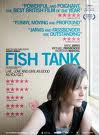 ange everything and bring love into their lives.
What attracts the audince into watching this film is that the character is a female and it suggests that it may be aimed at females. From looking at the poster and the image used, you are able to see the characters facial expressions; from this characters facial expression it fells like she is deep in thought, very lonley and looking out through the window. Furthermore looking at the background setting of the poster it shows her sitting a room of some sort. furthermore we are able to see drawing on the wall as well as having some sort of tear of the wall paper, this may suggest that she lives in a deprived area which then leads to social realism.
However on the other hand th poster on the left suggest the opposite to the character on the right. in the right poster she looks more dominant as the camera is slightly at a lower angle. furthermore the character lookis abit more 'chavy' with the big hoops and the necklace that she is wearing and makes her look more down market.
This film was given a number of awards as well as positive reviews. looking at the reviews of the film we can see that most of the review were from newspapers and magazines that are read by middles class people which suggests that the film has used a working class area and middle class are watching it.
From looking at the background of the film poster you are able to tell that this film is mainly based around a working class area, and shows what life is like. Therefore it shows that this is a social realism film.
 This is England is a film about a troubled boy growing up in England, set in 1983. He comes across a few skinheads on his way home from school, after a fight, They become his new best friends even like family. Based on experiences of director Shane Meadows.
What attracts an individual to watch this film is that it contains characters that are seen more as sterotypes and of diffrent age groups. thsi film also has male charcters as well as females indicating that the film is aimed at both genders and ages upto 18
Le donk is a film of a Rock roadie, Le Donk, who has lived, loved and learned. Along t he way, he's lost a classy girlfriend but gained a sidekick, Scorz-Ayz-Ee. He sets out to make Scorz a star with a little help from the Artic Monkeys.
From the poster for the film is looks more like a comedy film than a social realism film.
Some of the questions that we need to ask ourself is:
- who is the targetted audience for the film?
- what on the poster will attract the audience to watch the film?
- Is your audince Female, Male or both?
Here are some of the posters that we looked at:
 Fish Tank is a story of a young girl called Mia a 15yr old who is always in trouble and who has become excluded from School. One summer her mum brings home a mysterious stranger called Connor who promises to ch
 ange everything and bring love into their lives.
 What attracts the audince into watching this film is that the character is a female and it suggests that it may be aimed at females. From looking at the poster and the image used, you are able to see the characters facial expressions; from this characters facial expression it fells like she is deep in thought, very lonley and looking out through the window. Furthermore looking at the background setting of the poster it shows her sitting a room of some sort. furthermore we are able to see drawing on the wall as well as having some sort of tear of the wall paper, this may suggest that she lives in a deprived area which then leads to social realism.
However on the other hand th poster on the left suggest the opposite to the character on the right. in the right poster she looks more dominant as the camera is slightly at a lower angle. furthermore the character lookis abit more 'chavy' with the big hoops and the necklace that she is wearing and makes her look more down market.
This film was given a number of awards as well as positive reviews. looking at the reviews of the film we can see that most of the review were from newspapers and magazines that are read by middles class people which suggests that the film has used a working class area and middle class are watching it.
From looking at the background of the film poster you are able to tell that this film is mainly based around a working class area, and shows what life is like. Therefore it shows that this is a social realism film.
 This is England is a film about a troubled boy growing up in England, set in 1983. He comes across a few skinheads on his way home from school, after a fight, They become his new best friends even like family. Based on experiences of director Shane Meadows.
 What attracts an individual to watch this film is that it contains characters that are seen more as sterotypes and of diffrent age groups. thsi film also has male charcters as well as females indicating that the film is aimed at both genders and ages upto 18
Le donk is a film of a Rock roadie, Le Donk, who has lived, loved and learned. Along t
 he way, he's lost a classy girlfriend but gained a sidekick, Scorz-Ayz-Ee. He sets out to make Scorz a star with a little help from the Artic Monkeys.
From the poster for the film is looks more like a comedy film than a social realism film.
2nd March by Maiken Davidson
Today we logged our footage from Sunday on to the Mac and began to edit using final cut pro. Looking back at the shots, I believe are reasonably well framed and we used a variety of angles, however as it was extremely busy it was hard to keep track of the main characters as they walked through the town centre. We also had a problem with some of the shots as people walked in front of the camera.
In lesson we discussed poster plans and have drawn up 3 ideas (which are soon to be uploaded on to here), we trying to make it as close to social realsim as we can by using urban settings and not changing the base colour to much. We have also discussed tag lines.
We also took some still pictures of our internal location as we plan to do green screen tomorrow.


Subscribe to:
Posts (Atom)
