In what ways does your
media product use, develop or challenge forms and conventions of real media products?
Social realists main aim is to represent culture - Social realism is about making something seem realistic and typically British. Some directors who do this well are Ken Loach, Andrea Arnold and Mike Leigh.
Beginning: Our film starts with Kate (main character) lying in bed, this scene does not give anything about the films plot away. We wanted to keep the theme of social realism throughout our piece; however we also wanted to keep the audience interested in our film. Because it was social realism, we couldn’t have something big happening – such as the harry Potter films when there is a flying car.
Middle: Throughout our film, we wanted to keep the theme of social realism there, so, although our film had a similar story to films such as Peter Jacksons “the Lovely Bones” we could not have similar shots because the lovely bones is not social realism, the genre for this is more fantasy. However, we could use aspects of this film for ours – to help with our film posters because both films were about the loss of someone.
End: The ending of our film is when our story is actually told and when the audience actually realises that one of the characters is not actually alive anymore. This is a simple scene, with not much going on, but, we did want to give a lot of emotion still.
For our film, we had to do a lot of research in order to keep the social realism genre there. Our research meant we had to watch a lot of social realism films: happy Go lucky, brief encounter. I then watched a few more outside of college, in order to help with research – City Rats, Dead man running and Harry Brown.
I found that Harry Brown was useful because it carried a lot of social realism aspects.
Harry Brown has not got any similarities to our film – however, it is social realism and discusses an issues faced by Britain today – gangs and crime.
Our film discusses another issue faced by Britain today too – mental illness. So, it was interesting to see how director Daniel Barber handled this subject.
This was helpful because both subjects are likely to affect everyone.
Mental illness
The theme of “Mental illness” is apparent throughout our film. Social Realism tends to focus on different problems and issues. The film “eight” directed by Stephen Daldry highlights the Hillsborough disaster of 1989 and how that affected people for years onwards. The main character being an 8 year old boy, who’s father died in the disaster before he was born, and how his mother still isn’t handling it very well – eight years on. Like our film, the main focus is not revealed until the end of the film, when the main character states what has happened. Our theme is about mental illness, and this is something which unfortunately is not very often mentioned in schools, so therefore people aren’t as educated on this subject as they should be. There is actually a large percentage of people living in the UK who actually suffer from a mental illness or have done at some point in their lifetime. There were a lot of websites about mental illness, click here
Aspects of already existing social realist films:
We wanted our film to take on as many aspects of social realism as possible, so watching different social realist films definitely helped us not to go down the wrong track of attempting to make a big, Hollywood film.
Décor – The majority of our footage was shot in a town centre, which was useful because it helps give off the right effect, the genre of social realism. Again, to keep the house setting realistic, we left a few objects on the floor – because realistically, houses aren’t completely tidy, with nothing out of place.
Hair and Make-up – Realistically, people don’t look ‘perfect’ all the time, we don’t always where make-up and have perfect hair. So, to keep the genre of social realism we made sure that Kate was not wearing any make-up and her hair was pulled back, giving her a very straight forward look – not too glamorous and not too run down.
Sound – we used a lot of non-diegetic sound in this – We used a lot of music for the background, and we then recorded a voiceover, telling the story of our film. We had an alarm clock, because this is something which is a recognisable sound – therefore adding to the social realism affect.
Editing – Throughout our film, we used straight cuts. This was because this is typically used in social realist films. It is very unlikely that you will find a social realist film which uses big dramatic cuts such as “wipe” because this is much more dramatic.
How effective is the combination of your main product and your ancillary tasks?
Our poster
To get our poster to look like a real poster, advertising a real film – we had to look closely at other film covers, for the age group and audience in general we wanted. We wanted to see what font they had, what comments they had and what magazines these comments came from.
The font we used for our film was similar to the film train spotting, in that it was quite bold and therefore, easy to see. The colour and placing was the only thing different. The writing in ours was thick, bold and the colour was black – so therefore stood out.
The background for our poster is the park, which appears in our film – therefore the bold title can be seen easily.
Kate (The main character) can be seen on the poster, as the main image. She is looking over her shoulder, which can give a slight insight as to what our film is actually about.
We have an age certificate on our poster, to make it look more like a real film poster.
Film posters also have star ratings from magazines (Magazine ratings come from magazines aimed at the same audience of the film) The magazines we used were Bliss and Sugar.
The other information, such as the credits comes at the very bottom of our poster, in smaller writing – as this is not what needs to have the biggest impact on the audience -the title and comments needs to grab the audience.
Our review – To get our review to look like an actual review, we, like our film poster had to look at loads of different film reviews from review magazine “Little white lies.”
·The image in our review is of Kate, at the end of the film, when she is in the park – and realisation has just hit her that her friend is no longer around and is never coming back.
We used this image because it seemed like the most touching and would grab the readers’ attention quickly.
The reviews in “Little White Lies” tend to have a still from the film as the image – this is why we made this decision.
After looking at the different reviews from the magazine, we all designed our own reviews – and eventually decided on our own.
After i wrote the review, all three of us put it onto the layout – our layout was very similar to the one in “Little White Lies.”
We used four columns to put the text on, the text took up the bottom of the page – roughly two thirds of the page (The rest of the page was our image.)
At the end of the text we had some space, which had the ratings of our film.
Just before the text starts; we have the actor’s names, director’s name and the release date, all in boxes – just like they do in “Little white Lies.”
After looking at different reviews, i decided to write about the opening scene and the scene after this.
·I then went on to write about the emotion in the middle of the film.
I also wrote about the actors in the review and i used the feedback to be critical – which is the same as most reviews, there is always some criticism about the film in question.
Our poster and review do work with the film. I think that our film is clearly aimed at girls from the age of 12+.
The characters are teenage girls and both the poster and the review show this by having the main focus of them both as Kate – a teenage girl.
There is enough information given by the poster and review to grab the audience’s attention (if they are in this audience group) –The main character is clearly Kate as she is the main image on both of them (The images are both different.)
She looks upset and distressed in both images, and she is also alone – leaving the audience wondering why?
What have you learned from your audience feedback?
Our film was uploaded onto youtube, each member of our group then posted the link to social networking site “Facebook” which would enable us to get our peer reviews. I also asked for comments from people of a different demographic (25+, males) because this would help us to clarify if we did grab the correct audience. We wanted our film to be aimed towards teenage girls (12+) – so that is why facebook worked well for this; our friends are of that age group!
The main target audience for our film is teenage girls (Two characters in film are both teenage females) however, we still needed a wide variety of reviews from people of all ages and different genders.
What did we want to know?
Facebook enabled us to work out whether or not our film’s plot was understandable or not.
We wanted to know whether our editing worked well, or if there were mistakes.
The reviews would help us work out where we went wrong, what we could improve on, what we could have spent more time on and what went well.
We wanted to know if we had a good variety of shots throughout our film.
We wanted to know whether we had made the right choices, regarding the sound in our film.
The comments
We wanted to get both negative and positive reviews for our film – which we got.
The review: We wanted different reviews because it would be extremely helpful for us when it came to writing our film review – it would enable us to be much more honest about it. If we hadn’t had the reviews, we would have struggled to write the review as we would not have known whether or not to write positive thing’s about the film, or focus on the negatives.
The poster: The reviews we got also helped us when designing our poster, because it enabled us to have more of an understanding about whether we should give away more or less information about the films plot on the poster.
The Negative:
The problem:The alarm clock at the beginning meant that she wouldn’t have needed to be rushing around because she woke up as soon as the alarm clock went off – it may have been a minor thing but it could have been changed. The answer: We could have used something else, such as a mobile phone beeping or ringing, or a noise outside could have woken her – such as a car, a bang or some animals (birds, dogs.)
The problem: The cuts weren’t always done well, with moments where continuity didn’t happen because the cuts didn’t match. During the scene when Kate is searching for Ashleigh – she is in different positions after some cuts when she should be in the same place – just a different angle. The answer:If we had more time during editing, we may have been able to spend more time in changing this and making it work better. We could have also have had bigger variety of shots, so we would have more to choose from, which would mean we would have more chance of finding something to match the previous shot.
The problem: The film seemed quite complicated and those who watched it struggled to understand what was happening –until the very end when Kate says the line “I lost my best friend.” The answer: Without giving too much away, there was not much we could have done to change this. However, as some of the feedback stated, we could have had a few more hints throughout the film – such as having Kate walking past a graveyard and staring in there with a sad look on her face – giving the suggestion she has lost someone.
The problem:We were told that we did not have enough close-up’s of Kate’s face, the majority of the shots we had were long-shots, therefore we didn’t always show how Kate was feeling – you couldn’t tell from her body language. The answer: This is simple – we could have had a much bigger variety of shots, so therefore we would have been able to show how sad and angry she is feeling. If we had done this, our film may have had much more emotion to it.
The problem: The feedback seemed to highlight a lot on the fact that the voiceover did not show enough feeling and emotion, it seemed quite cold and therefore, like with the lack of shots we had – this meant we lost a lot of anger and sadness our film should have highlighted. The answer:We could have spent a lot more time on this, we only recorded the voice twice, so therefore, only having two to choose from meant that is was bound to seem rushed and lack emotion.
The problem:The scenes involving the green screen did not seem to work very well, because the characters legs got cut off and there was a moment when she seemed to be ‘floating.’ The answer :We could have shot this scene a few more times, so we could therefore, have more to choose from and it would have all fit together better.
The problem:When Kate is looking for her friend, there is a shot when she looks over the bed – our feedback stated that this seemed awkward and very unnecessary. The answer:After looking back at our film, I agree that this is not needed, and we could have probably got rid of it whilst editing.
The positive:
The scene order was good, the scenes worked well in the order they appeared and they flowed well.
The scene when the two characters are walking through town was complimented a lot in our feedback. With the comments saying that it helped establish how close the two girls are because it showed them walking, close to each other, talking and laughing.
Although we did not have a massive variety of shots, we did have a good variety of angles – with the scene when Kate is looking for Ashleigh using a high angle and eye level.
The fast cuts added to the pace of the scene when she is looking for her friend, which helped show how Kate is beginning to panic about her friend now.
Our ending scene when the two girls are sitting on the swings was good because it showed how the reality has finally dawned on Kate –her friend is never coming back. This also worked well with the ending comment. The feedback stated that this was a good conclusion the film.
Although the voiceover lacked emotion – the feedback we received stated that the backing music helped create the different feelings (Sadness, to worry, to despair.) The feedback did say that there were a few thing’s which could have been done slightly differently, such as the way the music went onto the next track – it could have faded slowly, rather than quickly cut. This, however, was just a minor thing and overall the choice of sound was good and received positive comments.
Foundation portfolio:
Our group did try to improve greatly on our work this year, in comparison to last years work – I do think that we managed to succeed in doing this.
We shot the scenes many more times this time (not just once or twice.)
We didn’t have a massive amount of shots, but there were a lot more than we had last year – meaning we had more shots to look at when it came to editing our work.
We had a bigger variety of angles in the scene – again meaning we had more choices during the editing process.
We did find out, however, that if we had spent more time concentrating on the lighting and framing of our scenes, we would have more time to spend on editing as this did turn out to be a big problem, resulting in us having to re-shoot a few scenes.
The problems with lighting meant that we had a silhouette in some of the internal scenes – such as the house, because the way the light cane in through the windows. To solve this problem, we changed to a different location and used red heads as well as the natural lighting coming from outside.
Other weaknesses i found:
When making decisions about our film – all members of our group discussed how we would have liked for our film to be set inside of the county mall (Crawley) because the shops, cafes and other businesses would be recognisable to our British culture and that would therefore help keep the genre of social realism. However, we were unable to get access to the mall (this was due to security.) After that, i asked if we were able to use the martletts (Burgess Hill) because even though it isn’t quite as big as our first choice, there are still recognisable shops, such as Costa, Waitrose and KFC –But, again, we were told due to security reasons, we would not be able to film there.
Due to this, this meant that we had to film outside of Crawley – which meant a lot of people were shopping – meaning filming proved difficult, due to people trying to talk to us when filming and standing in the way of us filming. It was also very busy, so it was quite hard trying to focus on what was actually happening in our film, because the main focus was often on people walking past.
I also found that some of the sound didn’t always work – such as the voiceover, when she is counting; it occasionally goes louder, then quieter again. This was because we were trying to get her voice to match her lips. This was difficult because we only had to recordings of her counting, so not much to choose from.
I think that although we did try and keep the mise en scene ‘typically British’ we could have done more, such as have more posters around Kate’s house – such as British bands like – Oasis, Stone Roses and The Beatles. Although, these aren’t typically what our intended audience would be interested in – they are all well known bands – British Bands, which would help make our film look more like a social realism film.
We could have also used a location such as Brighton as this is much better known. Often, when British films are set in the south, they are set in Brighton as it is a very well known city. Neil Jordan’s 1986 film Mona Lisa was set in Brighton, Paul Andrew Williams 2006 film London to Brighton was set there and Gurinder Chadha’s 2008 film Angus, thongs and perfect snogging was also set there. So Brighton would have definitely been more recognisable as British culture than Crawley.
Strength’s i found:
I think that because we had a lot of shots during the scene when Kate is looking for Ashleigh, this showed how Kate was ‘breaking down’ when coming to the realisation that her friend has actually passed away.
I also liked our different shots when the two girls are walking through town, because we used different cuts, to show how Ashleigh was not actually there – i think that although it seemed slightly confusing – it left the audience guessing.
The different angles we used were also nice because we were able to add to how frantic Kate is feeling at the moment – if we kept the shots at eye level for the whole film, it would have keep a slower pace.
I enjoyed the music because i think that the beginning soundtrack, with the guitars is typically British, you seem to hear a lot of acoustic guitar music in films – The British film ‘Notting Hill’ directed by Roger Michell shows this by playing the song “Aint No Sunshine”
How successfully have you used new technologies? How did you use new media technologies in the construction, and research, planning and evaluation stages?
We did use a lot of new media technologies – this is where last year’s foundation portfolio proved very useful, because that was when we learnt and used some of the them. There are also some technologies that i use every single day – so this was useful when it came to getting our audience feedback.
We used the same equipment as last year’s film, the only difference being the camera – This year we had a Sony camera, last year we used an XM2 and we have found that last years camera had much better quality and the picture was much clearer.
We did try something new – Green Screen. This was something which was new to all three of us, so therefore we were all quite worried as to how it would all turn out. The outcome was much better than what i expected, apart from a few minor problems – such as her legs being cut off. However, i did find that using green screen was quite interesting and our film definitely would not have worked because we wouldn’t have been able to have the character fading away.
Just like last year, we did all of our editing on Apple software “Final cut Pro.” This is something which allows you to cut, add effects and just generally edit you film how you want it. There are all sorts of films which have used Final Cut Pro when editing, films include Gore Verbinski’s 2002 film The Ring and Jared Hess and Jerusha Hess’ 2004 film Napoleon Dynamite.
We found that Final Cut Pro is good when editing because you are able to add a lot effects and are able to generally do more. An example being when Ashleigh flashes into the light at the end – this was easily done on Final Cut Pro (and green screen)
Our film is aimed at young teenage girls, so therefore the font we used was important when putting our credits – we did not want to use font similar to the font in films like 2009 film “The firm” directed by Nick love. This would not have appealed to our demographic which at all – which is why we used a calligraphy font.
When it came to actually putting our scenes together, all three members of our group had a go at doing this and we all found that final cut pro made this very easy for us to do. We all decided that we would use straight cuts for the ‘searching’ scene and i believe that this worked very well. We didn’t want to attempt to make the film look like an American action film – so therefore tried not to use too many dissolves.
For our sound we used Garage Band – we wanted to have Non-Diegetic throughout our film, so that is why we decided on having the acoustic guitar throughout, with Kate’s voice over the top – this helped make our editing much easier because we didn’t need to worry about the background sound.
We used a Dictaphone for the narration – which although we had difficulties when recording (Echo’s and not recording well) in the end, it did work very nicely and i believe this worked well with the rest of our film.
All three of our members researched on the internet for our film, not only researching on British Films, social realism directors, but i also researched into our main issue – mental illness. This is a very sensitive issue and we wanted to make sure that it was handled in the right way with a great amount of sensitivity – the internet was very useful in finding out about this.
To research more on British social realism we watched a lot of British films – this meant we were able to take things from them. Such as Mike Leigh’s Happy-go-lucky.
We also watched a few short films – as that is what ours was. Short films such as eight, directed by Stephen Daldry and Luke Snellin’s short film ‘mixtape.’
I found that Mike Leigh was very useful when researching because he has made a lot of British social realism films.
For our poster and our review, we needed to use both In design and Photoshop – although our group had used this once before, that was almost a year ago and therefore all three of our members found this difficult to use, however we did remember some of it so we were able to create a poster.
We all designed our own posters first, then decided which was the best and went on to design that on in design.
Our review was done in a similar way – each member of the group designed our own review and we then decided on who’s we would use. We wanted it to be similar in layout to a review from film review magazine “little white lies” and i believe that we did succeed in doing this.
I do not think that i have improved as much as i would have liked to when using Photoshop and in design as i did not use them enough, however when editing our film – i did feel i improved a lot compared to last years foundation portfolio.


 s” we could not have similar shots because the lovely bones is not social realism, the genre for this is more fantasy. However, we could use aspects of this film for ours – to help with our film posters because both films were about the loss of someone.
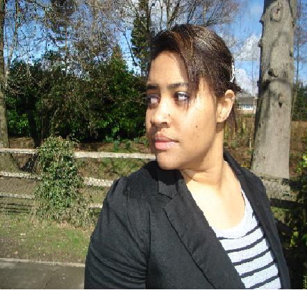 e-up – Realistically, people don’t look ‘perfect’ all the time, we don’t always where make-up and have perfect hair. So, to keep the genre of social realism we made sure that Kate was not wearing any make-up and her hair was pulled back, giving her a very straight forward look – not too glamorous and not too run down.
 text on, the text took up the bottom of the page – roughly two thirds of the page (The rest of the page was our image.)

 hen Kate says the line “I lost my best friend.” The answer: Without giving too much away, there was not much we could have done to change this. However, as some of the feedback stated, we could have had a few more hints throughout the film – such as having Kate walking past a graveyard and staring in there with a sad look on her face – giving the suggestion she has lost someone.
 now.
now. outh, they are set in Brighton as it is a very well known city. Neil Jordan’s 1986 film Mona Lisa was set in Brighton, Paul Andrew Williams 2006 film London to Brighton was set there and Gurinder Chadha’s 2008 film Angus, thongs and perfect snogging was also set there. So Brighton would have definitely been more recognisable as British culture than Crawley.
 something which allows you to cut, add effects and just generally edit you film how you want it. There are all sorts of films which have used Final Cut Pro when editing, films include Gore Verbinski’s 2002 film The Ring and Jared Hess and Jerusha Hess’ 2004 film Napoleon Dynamite.
